When you have gone shopping on the weekends, you have probably come across plenty of good and bad window signage. Now that you run your own business, it's time to design your own commercial signs. It is very important that you avoid making the mistakes that those retailers made with their bad signage. You want to attract potential customers rather than repel them. You need to make a good first impression by designing effective, eye-catching signs. Here are three mistakes that you want to avoid so that you don't lose business.
1. Choosing Fonts That Are Too Intricate
There are many different types of font that you can choose for your business sign. Because you want your sign to look great, you may be drawn to elaborate, fancy, and elegant typefaces. However, these fonts tend to be hard for customers that are driving or walking by your store to read—especially when these people are at a distance from the sign. Therefore, you need to stick to fonts that are clear and simple. Otherwise passersby will simply ignore your business and move on to the next one.
2. Selecting Extremely Small Text Sizes
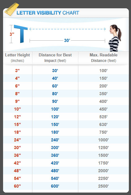
Just as choosing a simple font is important, selecting the right size of font is just as important. If you opt for font that is extremely small in order to fit the text in a small area on your storefront window, then you can't honestly expect customers to see the text as they drive by your store. And most people aren't going to want to get out of their vehicles in order to see what time you open and close on Saturday. Therefore, they will simply find a similar store that has hours displayed where they can see them. It is important to keep this in mind when creating your sign, as you want to ensure your customers can read your sign as they walk or drive by your store from a distance. For example, three-inch letters can be seen best at 30 feet but can be read at a maximum of 100 feet.
3. Opting for Several Bright and Bold Colors
When designing a commercial sign for your business, you should know that bold colors can be wonderful, as they will grab an individual's attention. However, too much of something can be a bad thing, and this is the case with bold colors. In fact, too many bold, bright colors can come off as aggressive, confusing, and difficult to read. Therefore, you need to try to focus on colors that work well with one another. For example, light text on a dark background or vice versa are good choices, as both of these are easy for potential customers to see and read.
Share11 January 2017
When you drive around town in your company vehicle, are you advertising? Have you ever thought about having a magnetic sign made for your vehicle so that you can advertise your business while you are driving? This is one marketing tool that so many people overlook. Why wouldn't you spend a little money on a magnetic sign for your car and simply stick it to the car when you are out and about? If you design the sign just right, it can be very effective in spreading the word about your business. To get some tips on designing magnetic signs for your car, visit my website.